As an “always on, always connected” smart phone user, you know immediately when a site you are browsing on your phone is not responsive. It’s those sites not geared for mobile, which force you to squint your eyes at teeny, tiny text, and pinch and expand your fingers on the screen, trying to click and tap on icons, navigation menus and images meant for the precision of a mouse on a large 15″ or 17″ monitor, rather than your clumsy finger on a 5″ mobile screen. In a word, mobile unfriendly.
Chances are, visiting non responsive sites happens to you on a fairly regular basis, especially if you are visiting small business sites. Eighty percent of them are still not designed to be responsive.
In an age when over half of Canadians use a smart phone, businesses that are procrastinating on taking their website mobile are not only risking an outdated image, they’re now actually inconveniencing one third of their potential clientele.
What is responsive design?
Here’s a brief 101 if you’re still not sure what makes a site responsive. A responsive website shrinks and expands to accommodate the size of the web browser you’re viewing it on, be it a desktop PC, tablet, or smartphone. This means the menu, fonts and layout are dynamic and change to fit your screen size, enhancing the overall user experience.
Why upgrade to responsive web design?
We know that delaying ‘going responsive’ makes your site look outdated, and makes the user experience of browsing your site decidedly less convenient and engaging. What you may not know is that keeping your old non-responsive design will also actually cost you – by making you less visible to anyone using Google search to look for businesses like yours on their smart phone.
Google’s Mobile Friendly update this past April 2015 has wreaked havoc on websites that are not coded with responsive design by rewarding many sites that are responsive with higher rankings on mobile search results. This means that even if you have opted to invest in SEO, your site may still not show up on the first few pages of mobile search results if your site is not responsive. Moreover, with an overwhelming 75% of consumers preferring sites that are mobile friendly, you may miss out on the ever dominant mobile customer.
So what does a site that has been coded with responsive web design look like?
Here is an example of two e-commerce websites opened on an Android phone. At left is a non-responsive BBQ parts store site, while the right is the responsive website for lowes.com
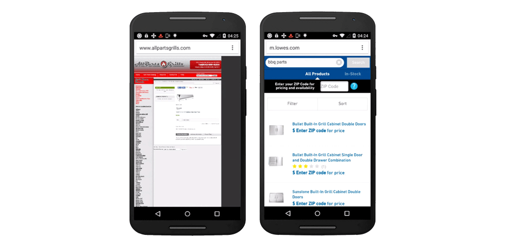
As you can see by the left website’s tiny and illegible menu, it did not adjust to fit the Android’s screen, which makes navigating the page quite difficult. Pinching and expanding will definitely be necessary. Parts of the screen are also cut off, making it impossible to see full product images. This is a big potential opportunity cost for the retailer. Cause I bet BBQ parts shoppers are also big mobile users. Nobody wants to drag their laptop onto the patio to spec out that replacement grill part they’re shopping for. But I digress…
On the responsive lowes.com site, the product listing page appears in full and the menu provides clear, larger, quick options to navigate to categories and products. No finger pinching or expanding on the screen is required because everything is sized to fit your eyes, fingers and user behaviour. It’s also notable that we found the non responsive site quite a ways down on search result pages as well.
Many sites are taking heed of the responsive challenge. Google reported a 4.7% increase in the amount of mobile-friendly sites on the web in the two months following the update.
Is My Site Responsive?
Still not sure if your site is responsive? Here’s how to check.
- Use online resources. Check to see if your website is responsive by using this Google responsive design checker It will show you how your website looks on a variety of different devices.
- Do a side by side comparison. If you open your website on your phone and it looks more like the BBQ parts website on the left, it is not responsive. If it looks more like the Lowes site above, congratulations—you’re ahead of the pack!
Some of our Recent Responsive Web Design Case Studies
Check out these case studies and sample sites that we recently designed:
- WordPress responsive web design and SEO for a medical clinic
- WordPress responsive web design, SEO and social media management for a local Markham banquet hall
- WordPress responsive web design and SEO for manufacturing company
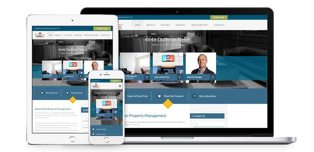
- WordPress responsive web design for property management company
Next Steps
If your website is still not enabled with responsive web design, consider hiring a professional to redesign it to mobile standards. As experts in Toronto responsive web design, we offer a variety of services including responsive WordPress design, ecommerce site design, SEO and more. Contact us for more information on how to get your website up to date and mobile friendly.
